
United By Our Differences
D&AD New Blood Academy
Brief: Showcase the action that HSBC has been taking to create a more digitally accessible webspace.
As part of the New Blood Academy, we were put into teams to tackle a brief in a week and pitch to the WPP network. Our team was made up of Adrian Rosleff, Daiki Shinomiya, Georgie Hall and Harriet Yakub.
We identified the core issue to highlight in the campaign early on.... only 2.6% of all home pages were fully compliant with web content accessibility guidelines. That’s not acceptable with over 15% of the world’s population being neurodiverse or people with dissabilities unable to access these sites. We wanted to not only showcase the work that HSBC has been doing to bridge that gap, but to also opening up traditionally internal design conversations to the public with our campaign.
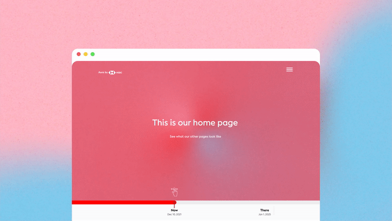
With this is in mind, we created Aura by HSBC.
As part of the New Blood Academy, we were put into teams to tackle a brief in a week and pitch to the WPP network. Our team was made up of Adrian Rosleff, Daiki Shinomiya, Georgie Hall and Harriet Yakub.
We identified the core issue to highlight in the campaign early on.... only 2.6% of all home pages were fully compliant with web content accessibility guidelines. That’s not acceptable with over 15% of the world’s population being neurodiverse or people with dissabilities unable to access these sites. We wanted to not only showcase the work that HSBC has been doing to bridge that gap, but to also opening up traditionally internal design conversations to the public with our campaign.
“With transparency and accountability as our ancors, we created a microsite and additional digital plugin which can survey, through heatmap inspired infographics, how people really feel when accessing any website.”
With this is in mind, we created Aura by HSBC.

My main role was to develop the humanistic and empathy led concept, and develop the “Aura” visuals, I began by playing around with their brand colours and assets to see what could be created. I was inspired by heatmaps and eye-tracking softwares - but I found that the huge range of colours became quite difficult to look at, and in essence took away from the accessible nature we wanted to bring into the future!
We took straight from their brand guidelines but often it would be very confusing to look at so I decided to simplify the colour pallete. The red areas represents a feeling of being lost, The pink areas represents a feeling of happiness, The blue areas represents a feeling of confidence.
We took straight from their brand guidelines but often it would be very confusing to look at so I decided to simplify the colour pallete. The red areas represents a feeling of being lost, The pink areas represents a feeling of happiness, The blue areas represents a feeling of confidence.
“Our aim is for HSBC to lead the way to a fully blue site aura by raising awareness of the faults in the digital platforms out there.”